Nothing Phone 4A Design Reveal: New Glyph Bar & Industrial Look
 Team Gimmie
The Glow-Up: Why Nothing’s Phone 4A is Flipping the Script on Mid-Range Design
There is a specific kind of satisfaction in owning a device that doesn't look like it was birthed from the same sterile, aluminum-and-glass factory as every other smartphone. When you set a Nothing phone face-down on a table, it doesn't just sit there; it communicates. It’s a mix of raw industrial exposure and futuristic light-play that has become the brand’s calling card. With the official reveal of the Phone 4A’s rear design, Nothing is doubling down on that visual identity, proving that mid-range doesn't have to mean middle-of-the-road.
The Evolution of the Glow
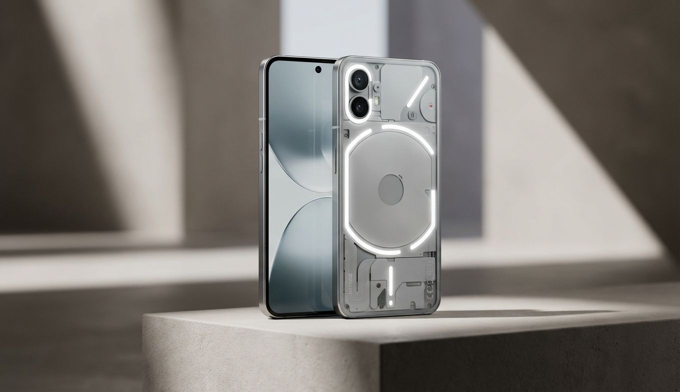
The centerpiece of this new reveal is the updated Glyph Bar. For the uninitiated, Nothing’s Glyph Interface is a series of LED lights embedded behind the transparent back panel. It’s meant to provide "silent" information—letting you know who’s calling or how much time is left on your Uber arrival without you ever having to wake the screen.
On the Phone 4A, the design has evolved from the flowing light strips of previous generations into a more structured, segmented bar. We’re looking at nine individually controllable mini-LEDs arranged into seven distinct square lights. It’s a geometric shift that feels a bit more intentional and technical. Of those seven squares, six glow a crisp white while one provides a single, sharp pop of red.
Beyond the layout, the big news is the 40% increase in brightness compared to the previous A-series models. This isn’t just about being flashy. In a bright office or outdoors, the previous Glyph lights could sometimes be easy to miss. This extra punch ensures the visual notifications actually do their job. It’s a practical upgrade to a feature that skeptics often dismiss as a gimmick, but fans swear by for reclaiming their focus from the "black hole" of a traditional smartphone screen.
Inside Out: The Industrial Aesthetic
The Phone 4A stays true to the transparent-industrial look that has defined Nothing since day one. Instead of hiding the internal components behind a sheet of opaque plastic, Nothing treats the circuitry like art. It’s an "exposed" aesthetic that feels raw and honest. You can see the placement of the triple camera island, the protective plates, and the delicate ribbons of the internal assembly.
This design language appeals to the kind of person who appreciates how things work. It’s tech-forward without being "gamer" loud. However, it’s worth noting that this look is a commitment. A transparent back is essentially a showcase for fingerprints and dust, and while Nothing does a great job of making the internals look organized, it lacks the "clean" minimalism of a standard matte-finish phone. You’re trading a boring, smudge-free surface for a conversation starter that requires a bit more maintenance to keep looking pristine.
Beyond the Specs: The Personality Play
In the mid-range world, you’re usually choosing between a Google Pixel’s camera or a Samsung’s screen. Nothing is trying to carve out a third path: the choice based on personality. The Phone 4A isn’t just competing on megapixels or processor speeds—though it needs to be competent in those areas—it’s competing on how it makes the user feel.
Using the Phone 4A is about embracing a slightly unconventional workflow. It’s for the user who wants to tinker with light patterns to distinguish a work email from a text from their partner. It’s for the person who is tired of the "slabs of glass" era and wants a device that feels like a piece of modern design. Nothing is betting that there’s a significant audience that values this distinctiveness over the safe, predictable choices offered by the tech giants.
The Gifting Guide: Who Is This For?
Choosing a phone for someone else is always a gamble, but the Phone 4A’s unique design makes it a bit easier to categorize. If you’re considering this for a gift, look for these traits:
-
The Tech-Tinkerer: Does the recipient love customizing their home screen, picking out unique cases, or geeking out over industrial design? They will love the granular control of the Glyph Bar.
-
The Focused Minimalist: If they are someone who tries to limit their screen time, the Glyph Interface is a genuine tool. It allows them to leave the phone face-down and only pick it up when a "VIP" notification triggers a specific light pattern.
-
The Style Seeker: For the friend who always has the coolest, most unique gadgets that no one else has heard of, the Phone 4A is a perfect fit. It’s an immediate conversation starter.
-
The Practicalist: Warning—if the recipient just wants a phone that "just works" and they plan on slapping a thick, opaque case on it the second they get it, this isn't the phone for them. You’d be paying for design features they’ll never see or use.
Finding the Balance
As we look toward the full launch, the success of the Phone 4A will ultimately depend on the "boring" stuff: battery life, camera performance, and the price tag. Nothing has nailed the aesthetic, and the Glyph Bar is a more refined version of an already cool idea. But a phone can’t live on lights alone.
If Nothing can keep the price competitive—likely in that sweet spot between $350 and $450—while providing a camera that can handle a night out and a battery that survives a full workday, they’ll have a winner. The Phone 4A is shaping up to be a device for those who want their technology to have a bit of soul. It’s a reminder that even in a world of mass-produced gadgets, there’s still room for a little bit of glow.